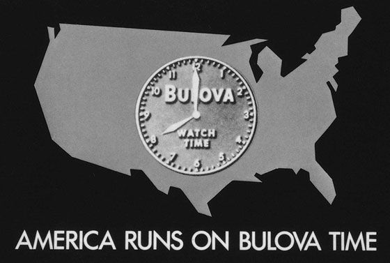
On the first day of July in 1941 a few lucky New Yorkers with televisions tuned in to the WNBT station to see their Brooklyn Dodgers take on the visiting Phillies. The handful of baseball fans who got to their television sets early for this broadcast were about the experience history: they were about to see the first ever paid television advertisement.
Instead of the usual test pattern clock that was displayed between programs, viewers saw a modified test pattern clock modeled after Bulova brand watches, complete with the company logo and the tagline “America Runs On Bulova Watch Time.” What lacks in the unimaginative tagline is made up for with the clever, almost too obvious, use of product placement in a familiar way. American television viewers saw a test pattern clock daily on their TV screens and it wouldn’t come as too much a shock to any of them to see the same clock in a new context. Perhaps the advertisers for Bulova knew they would have to slowly teach American viewers what a TV advertisement was and how the viewers should respond.
Commercials as a medium were heavily influenced by the media that came before them, especially the cartoon short. Long before cartoon characters showed up on televisions in the family room they were being seen in movie theaters across the country. In this era before home television, feature films were shown with newsreels, movie trailers, and cartoon shorts. Animators like Chuck Jones, Ub Iwerks, Pat Sullivan, and Walt Disney made their bones early with specifically this kind of media. When television entered the scene it didn’t take long for these cartoon shorts to migrate, both as featured content and mimicked in the commercials.
When this migration of cartoons to TV finally occurred during the 1950s, a taxonomy of commercials was established. Commercials had an average length of 1 minute and were typically animated. They featured jingles (usually full, original songs) and a steady stream of declarative information about the products and the stories used to tell them. Let’s take a look at few commercials and see how quickly they adopted fairy tale iconography.
This Bab-O Cleaner commercial is a textbook example of the 1950s television commercial. But even more interesting (for the purposes of this blog, anyway) is that this commercial acted as a primer for the series of Bab-O spots that would follow it–a series that featured figures from history and fairy tales interacting with the product. Below we see how Cinderella meshes with the 50s era TV commercial style.
Integrating fairy tale motifs was handled without much elegance in the 50s. The figures of Cinderella’s world use the same language and style as the declarative copy used in the first ad in the campaign. The fairy tale figures are secondary (by a long shot) to the goal of explaining what a product is and what it can do for the American shopper. Cinderella is inserted into a commercial and is nothing more than a familiar name. The same is essentially true of Pocahontas and John Smith’s inclusion in a later Bab-O commercial.
This sloppy combination of ads and fairy tales wasn’t a localized problem for Bab-O. Submitted for your viewing is a 1952 commercial for Halo Shampoo featuring Goldilocks and the 3 Bears.
Again, the idea of a folk lore or fairy tale figure was repeated for this campaign, including other inelegant uses of mermaids, elves, and (again) Cinderella.
In her 1997 article “Fairy Tale Motifs in Advertising,” Patricia Baubeta attempts to answer the question of why advertisers so quickly turned to fairy tale iconography and why they continue to decade after decade. She points out fairy tale figures are familiar, cute, and feel-good, but there is a factor even more important:
“If we ask why advertisers use fairy tale motifs, the answer is obvious. Because they work.”
In the next post on this series I’ll talk more about why they work and see how fairy tale iconography is used better over time. Next up, the 1960s.
